Google updates Android logo with a modern design

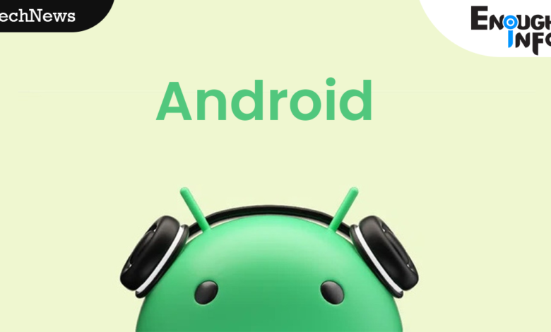
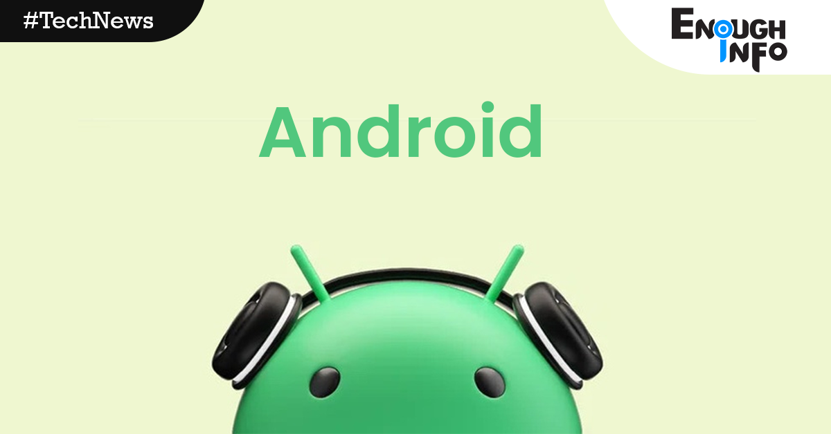
Google updates Android logo with a modern design: Google modified the Android logo and related branding to provide a more contemporary appearance just before the introduction of Android 14. EnoughInfo.com
Years have passed since the latest update, which occurred in 2019. Helping to link Android to Google is the redesign’s overarching objective, according to Google.

Google updates Android logo with a modern design
The initial letter of the first alphabet is now capitalised in the Android text logo. It gives the logo additional weight and improves its appearance when paired with the Google logo.
Previously, the Android text logo was created using lowercase letters by the firm. In addition, the robot face in the Android logo now seems three-dimensional. Obi and Atiku absent as Tribunal delivers judgment
Google claims that the Material You design language served as inspiration for the new logo. It can adjust to different colours, just as Material You, and it goes well with Google’s colour scheme.
In its official blog post, Google said,
“Each time we overhaul our branding, we evaluate not only changing needs, but also future goals. We know people today want more choice and autonomy, and we want our brand to be reflective of Android: something that gives people the freedom to create on their terms. As an open platform, it’s important that both our technology and brand are an invitation for people to create, connect, and do more with Google on Android devices.”


